Photos by Rich Michell
The longtime owners of this Colonial-style home knew it was steeped in history. In fact, it’s one of the many properties in their neighborhood constructed between 1910 and 1925. From the outside, the house fits in, as its exterior hadn’t veered too far from its 1912-era Colonial façade. The interior, though, had gone through a few iterations—the most recent being a late-1970s remodel that left the kitchen cramped, dark, and dysfunctional.
Years ago, the couple entrusted principal David Heide of David Heide Design Studio to revamp the home’s lower level (adding central air conditioning, integrating more storage, and moving walls) and oversee an upstairs bathroom renovation. When it came to remodeling the kitchen, the goal was to preserve the home’s character but take it to new heights. To do exactly that, the Minneapolis-based firm added modern amenities and took cues from the house’s 100-plus-year-old history. After a full gut of the room, already an anomaly due to its unique placement at the front of the home, architect Chris Christofferson was tasked with reinventing its layout. “Every inch counted,” recalls Christofferson.

“David and Chris brought us four sets of plans, and the first three were designed in the existing space. The fourth one added a 28-foot addition,” explains the wife. “It struck me immediately as a really ingenious solution. Once you had seen this plan, you couldn’t unsee it.”
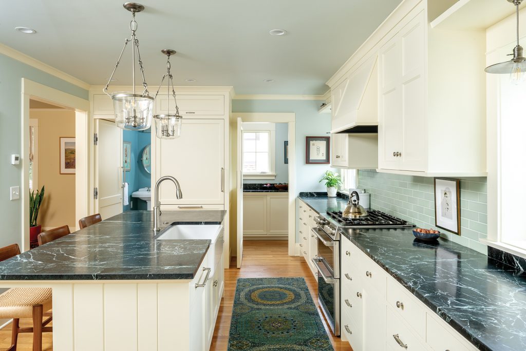
This new addition was the linchpin in creating a kitchen that seamlessly flows with the home’s existing layout. Working closely with frequent collaborators Dovetail Renovations, Heide and Christofferson revamped the kitchen with double electric ovens, a stove with six gas burners, and a calming seafoam-colored backsplash, and resituated it so the range and bay of countertops were set against the home’s front wall. A large island with a sizable farmhouse sink grounds the space. Thanks to a new opening between the kitchen and dining room, anyone working at the island has a complete view of the ground floor—all the way to the home’s nature-filled backyard. “It’s true,” Heide says. “You can stand at the kitchen sink now and look out through the dining room over the bluffs.”


The design firm also collaborated with Braaten Creative Woods on a combination of closed and open storage solutions. Each cabinet isn’t filled with pantry items or pots and pans like one might expect, though, and this is where Christofferson’s creativity shone. Behind one cabinet-style door lies the refrigerator, but open another and you’ll find a tucked-away hallway leading to a private powder room. “When [the door is] closed, it’s a totally separate room—almost a hidden space,” says Christofferson.

As experts in historic preservation and remodeling projects, David Heide Design Studio took care in matching the millwork to the rest of the home and choosing cabinetry that recalled 1920s-era furnishings. The butler’s pantry also fits perfectly into the kitchen’s new layout, conveniently stationed to the left of the island behind a swinging door for easy in-and-out access. Similar to the main space, the pantry features open and closed cabinetry—a friendly reminder that a lack of storage will never be an issue in this home.
There’s no shortage of space for entertaining either. The kitchen island, now large and functional enough for the couple, doubles as a place where guests can pull up chairs for catch-up conversations. “It’s so easy to cook and have a crowd of people in here, which we actually got to do a little before quarantine,” says the wife. “We must have had 25 people here for a Thanksgiving dinner.”
In the future, the homeowners are looking forward to a post-pandemic time when they can host friends and family in their light-filled kitchen. After all, one could argue the best part of living in a beautiful space is sharing it.
